






© 2026 Aleks Brand. All rights reserved.

Cassie
Financial Planning & Contract Management
Overview
Cassie is a financial planning and contract management platform built for growing businesses.The founders had already identified their audience before the project began.The challenge wasn't figuring out who the product was for—it was creating a brand that felt trustworthy enough for finance professionals while standing apart from an industry filled with generic blue software companies.The result was a complete brand strategy, positioning system, messaging framework, visual identity, website concept, and product experience designed around one idea.
Challenge
Most finance and legal software companies looked and sounded the same.Their websites were filled with dashboards, enterprise-style branding, technical jargon, and generic promises about efficiency. The category felt functional, but rarely memorable.Cassie operated in a category where trust is everything. Financial forecasting influences hiring decisions, spending decisions, growth decisions, and long-term business strategy.The brand needed to communicate trust, accuracy, reliability, and professionalism—without disappearing into a sea of identical competitors.
Approach
Through interviews with the founders and category research, a clear pattern emerged.Growing businesses were spending enormous amounts of time managing spreadsheets, maintaining forecasts, and manually reconciling contracts with financial projections.Many teams were asking the same fundamental question: "Do I spend more money than I make?"Finance and legal teams operated in separate systems, forcing businesses to connect information manually and make important decisions with incomplete context.Instead of positioning Cassie as another forecasting tool, we positioned it as the place where finance and legal come together.Rather than helping businesses understand what already happened, Cassie was built around a more valuable outcome: helping them understand what could happen next.This strategic shift became the foundation of the brand and evolved into a simple promise:
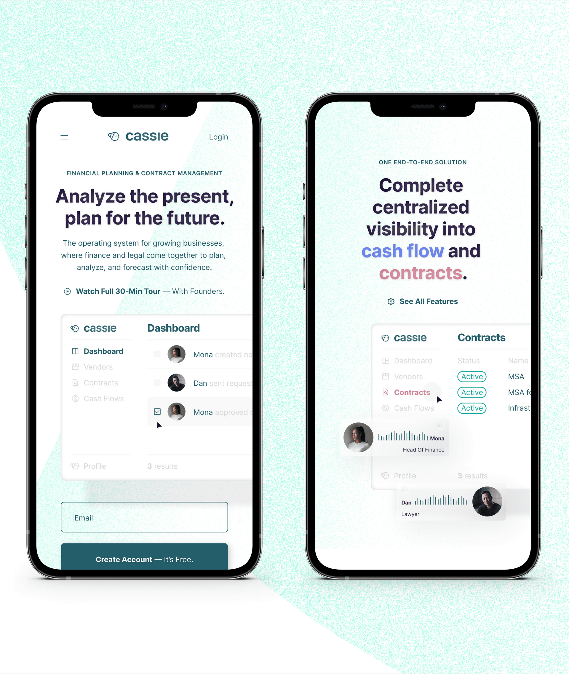
Analyze the present. Plan for the future.
Solution
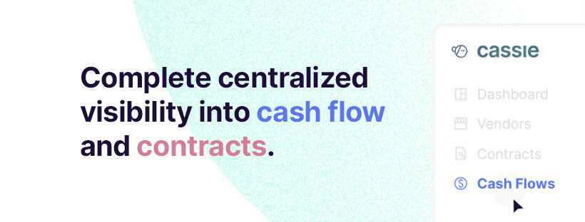
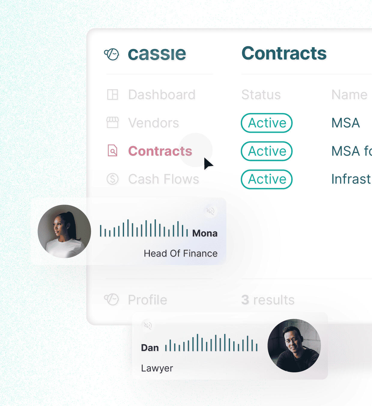
The messaging focused on business outcomes rather than software features, positioning Cassie as a bridge between legal and finance teams and providing complete visibility into cash flow, contracts, and future financial commitments.Visually, the identity intentionally moved away from the clichés of finance software.Instead of dark blues and corporate aesthetics, the brand adopted soft mint and teal tones, clean editorial typography, spacious layouts, and human-centered product storytelling.The website reinforced this positioning at every level, emphasizing clarity, confidence, and strategic control rather than technical complexity.
Outcome
The result felt approachable and contemporary without sacrificing credibility.This balance helped the brand communicate trust while remaining visually distinctive in a conservative category.The project delivered a complete brand system including strategy, positioning, messaging, visual identity, website design, product direction, brand guidelines, and marketing assets.The final result was a finance technology brand that balanced two objectives that often conflict:Trustworthy enough for finance professionals. Distinctive enough to be remembered.

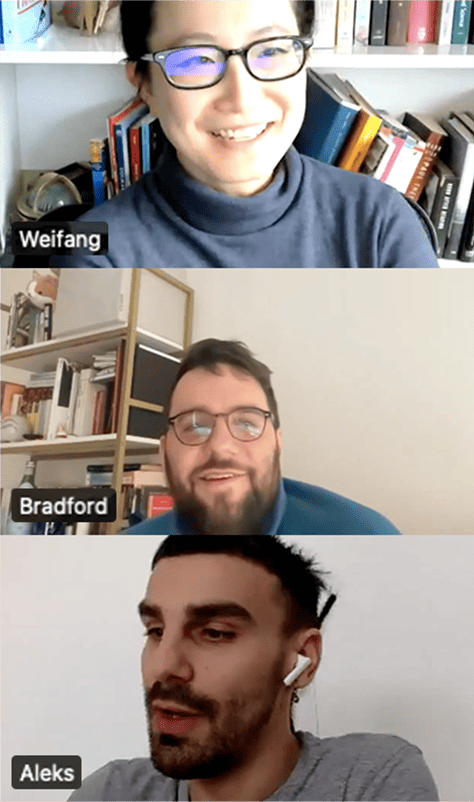
Aleks was a joy to work with.He developed an intimate understanding of our brand and aesthetic over the course of a few weeks, and produced a brand vision that really helped us structure and provide conceptual and go to market direction on our product.
I feel very confident in the final output of the project. Would highly recommend.
Project Info
Client: Weifang Zhu, COO at Even Financial
Industry: FinTech
Market: United States
Year: 2022Services: Market Research, Competitive Analysis, Brand Strategy, Positioning, Messaging, Visual Identity, Website Design, UI Direction, Creative Direction, Brand Guidelines


Fount
Applied Employee Experience
Overview
TI People had already established itself as a respected employee experience consultancy, working with organizations such as Adidas, IKEA, Siemens, Novartis, Raymond James, and Humana.Years of consulting work had led to a breakthrough: a scalable software platform designed to help organizations continuously improve employee experience through data-driven decision making.The opportunity was significant enough to secure $8 million in Series A funding before the product had a name, positioning, or public-facing identity.Before the company could enter the market, attract customers, or communicate its vision to investors, it needed a complete strategic foundation.
Challenge
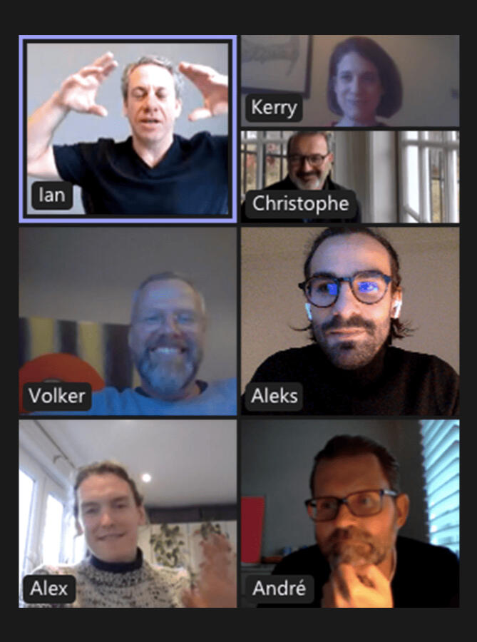
The funding already existed. The product idea existed. The problem was that nothing existed around it.There was no name, positioning, messaging framework, visual identity, or unified story capable of aligning leadership, investors, employees, and future customers. The stakes were unusually high.This wasn't a startup searching for product-market fit—it was an investor-backed company preparing to launch a category-defining product.The brand needed to justify investor confidence, support future growth, and establish credibility with enterprise buyers from day one.Adding another layer of complexity, the project involved multiple founders and executives across Europe and the United States, each bringing different perspectives, assumptions, and priorities.The challenge wasn't simply creating a brand. The challenge was creating a shared vision.
Approach
Before touching visual design, we focused on understanding what the company truly represented, who it served, and how it should position itself within the market.Through a series of workshops with the leadership team, we developed the strategic foundation for the business, including positioning, messaging, naming, communication principles, and brand direction.One of the most important discoveries was that the company wasn't simply selling employee experience software. It was helping organizations become more experience-centric.This insight led to the creation of a new positioning framework: Applied EX (Applied Employee Experience)This framework transformed a complex consulting methodology into a clear, scalable product story.Rather than selling software features, the company could now sell a vision for how organizations understand, improve, and manage employee experience at scale.
Solution
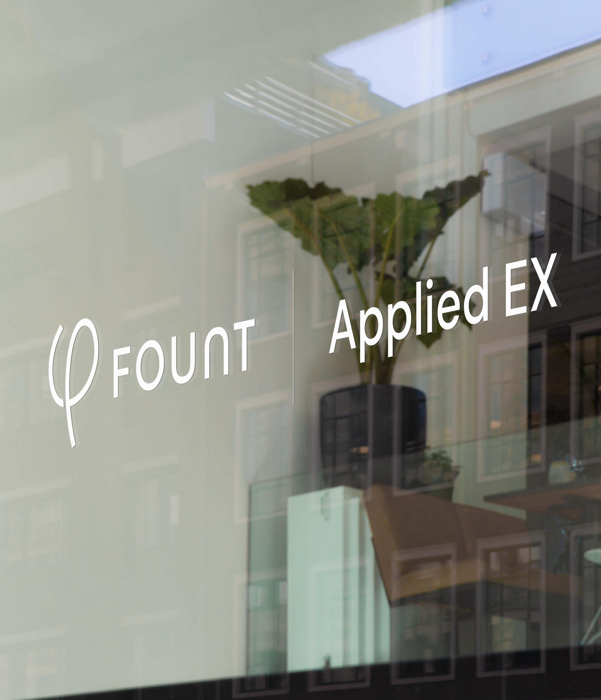
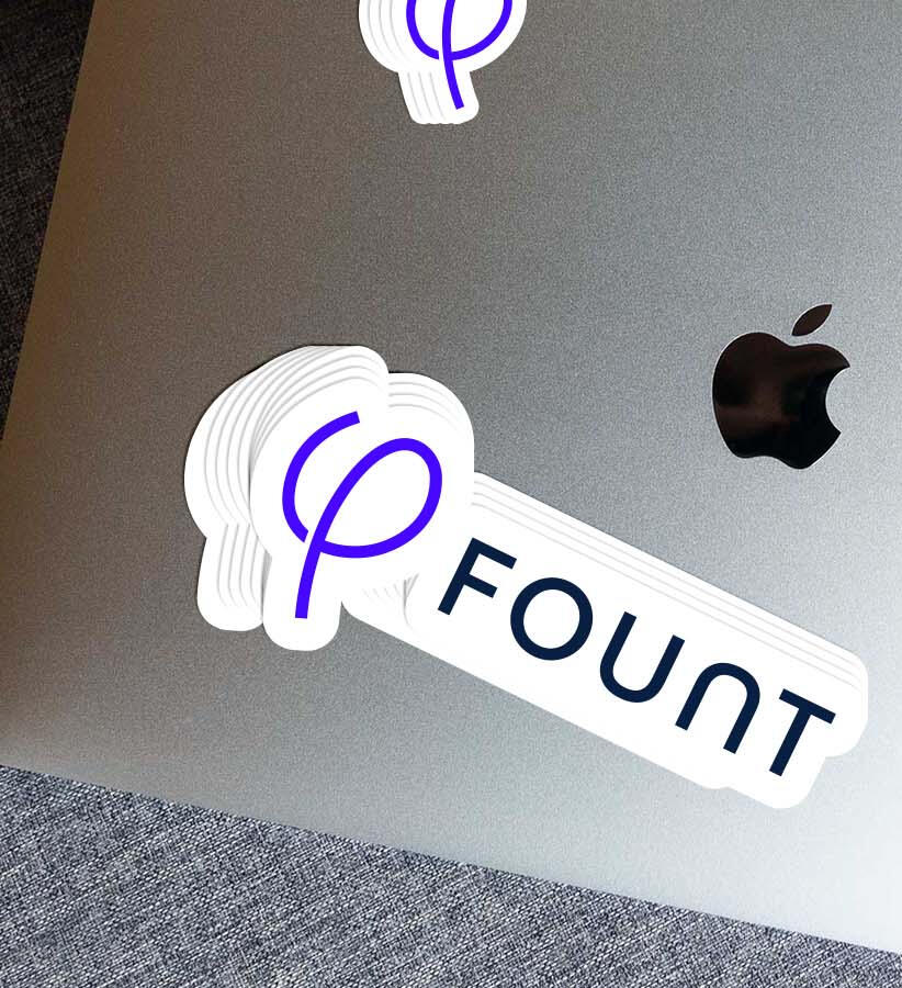
With the strategic foundation established, we developed the complete brand system around a simple promise:We make companies more experience-centric.The engagement included category development, naming, messaging, visual identity, brand guidelines, website direction, and launch assets.The company was ultimately named FOUNT, inspired by the idea of a source—a place where improvement begins.Credible enough for enterprise buyers, memorable enough for marketing, and flexible enough to support long-term growth.The visual identity balanced enterprise credibility with modern simplicity, creating a brand capable of communicating trust, strategic clarity, and long-term scalability while standing apart from traditional HR and enterprise software competitors.
Outcome
FOUNT launched with a complete strategic and visual foundation capable of supporting an investor-backed SaaS company from day one.What started as an unnamed product evolved into a fully articulated brand with a defined market position, category narrative, messaging framework, scalable identity, and unified leadership vision.Most branding projects begin with a company. This one began with an idea, a team, and $8 million in investor expectations. The goal was to build the brand that could carry all three.

A fantastic process that Aleks had built and was following through with us as the leadership team of a brand-new, VC funded, European / U.S. SaaS company.
The branding approach simply works, it's comprehensive and complete.Aleks is a knowledgeable and likeable person to work with, he is showing resilience and patience when working with a group of executives and entrepreneurs, and the end-result was a fantastic deliverable:A complete brand including brand assets, style guide, brand touchpoint design guidelines.
Project Info
Client: TI People
Industry: B2B SaaS
Market: United States, Europe
Year: 2022Services: Market Research, Competitive Analysis, Positioning, Category Development, Audience Development, Messaging, Naming, Visual Identity, Website Direction, Brand Touchpoint Design, Brand Guidelines


Liquid London
Pheromone Fragrance Formula
Overview
Liquid London was created by the team behind The Essence Vault, one of the UK's largest designer-inspired fragrance companies.After identifying the rapid growth of pheromone fragrances across TikTok and social media, the opportunity became clear.While demand was exploding, the category itself was saturated with low-quality products, generic branding, and short-lived dropshipping businesses.The goal was to create a legitimate brand capable of elevating the entire space.
Challenge
Most pheromone fragrances looked and felt the same. Competitors relied on exaggerated claims, poor design, generic packaging, and products with little long-term credibility.Customers treated the category as a novelty purchase rather than a brand they could trust and buy from repeatedly.The challenge was to build a brand that felt desirable, premium, and culturally relevant while preserving the excitement and curiosity that made the category so popular in the first place.
Approach
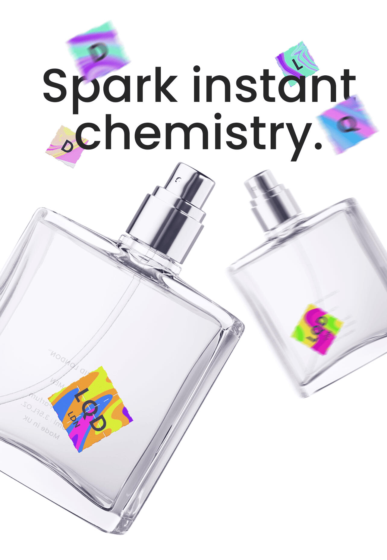
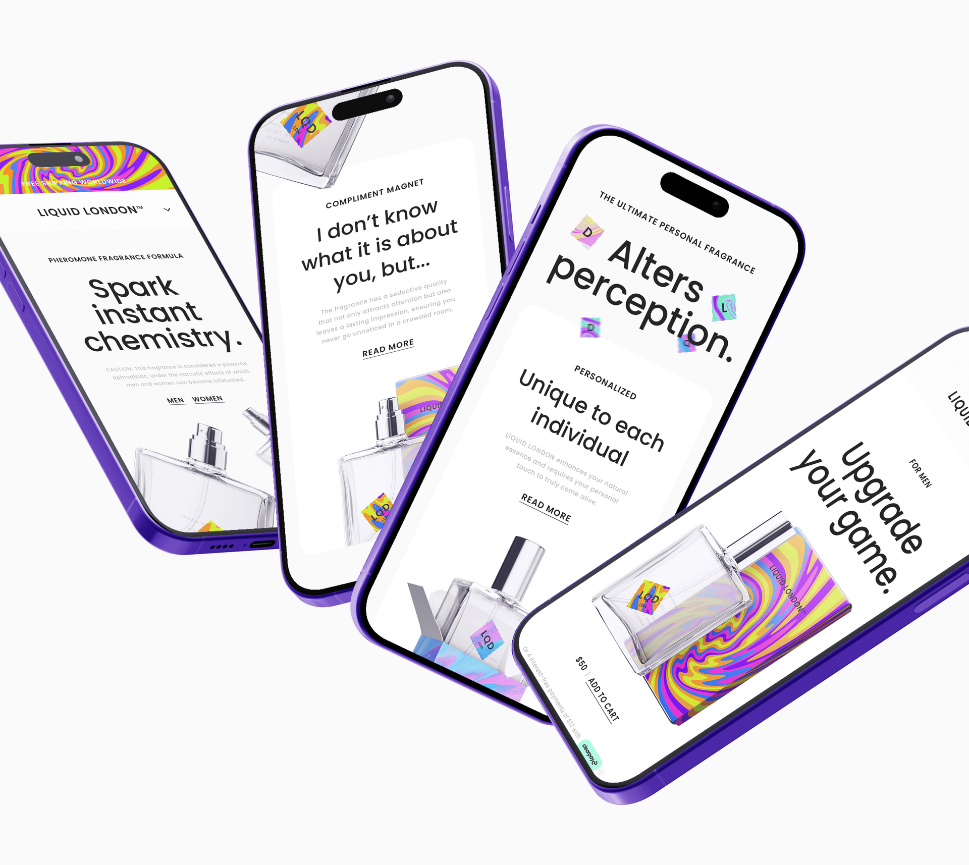
The project began with a series of strategy workshops covering market research, competitive analysis, positioning, messaging, product differentiation, and customer psychology.A clear pattern quickly emerged. Most brands were selling attraction. Very few were building trust.Rather than competing through louder claims, we positioned Liquid London around a more sophisticated idea: chemistry.This became the foundation for the entire brand. Not attraction. Not seduction. Chemistry.A concept broad enough to feel aspirational, emotionally engaging, and commercially scalable.The positioning ultimately evolved into a simple promise: Spark Instant Chemistry.
Solution
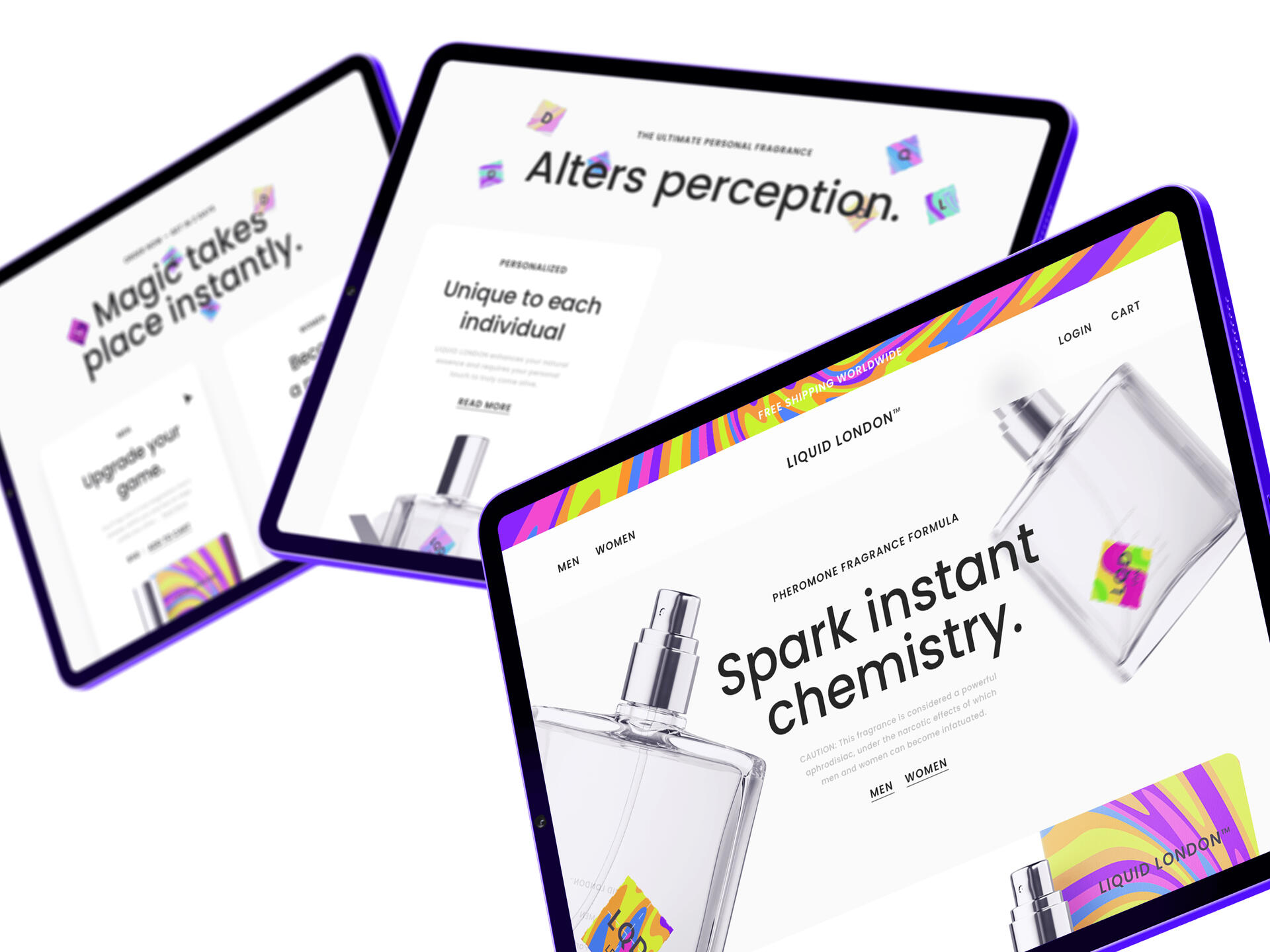
The visual identity was designed to make chemistry feel visible.Inspired by altered perception, attraction, magnetism, and human connection, the brand combined clean typography with vibrant psychedelic gradients, holographic-inspired assets, and fluid visual systems that felt impossible to ignore.Every touchpoint was built around the same strategic idea.The messaging focused on chemistry, confidence, connection, and first impressions.The packaging transformed the product into a collectible object rather than a generic fragrance bottle.The website translated complex product benefits into a simple and highly visual ecommerce experience designed to educate, persuade, and convert.Beyond the identity itself, I developed the brand strategy, positioning, messaging framework, packaging concepts, website experience, product storytelling, and creative direction across the launch ecosystem.
Outcome
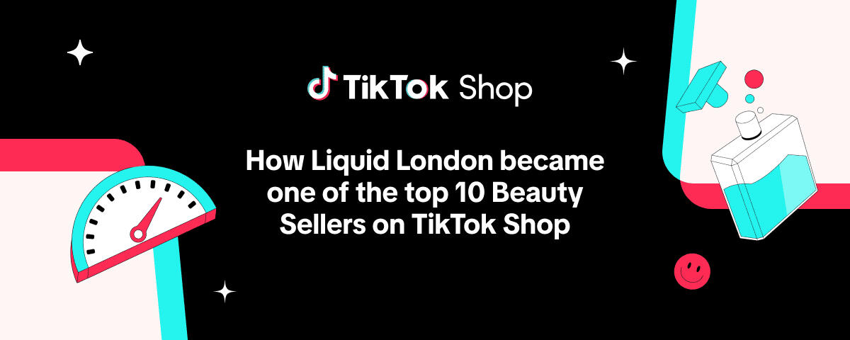
Liquid London established a premium foundation for a category that had previously been defined by short-term products and weak branding.Instead of borrowing from traditional luxury fragrance aesthetics, the brand embraced a more contemporary visual language inspired by culture, virality, perception, and human chemistry.The result was a distinctive challenger brand designed to stand apart in one of the fastest-growing fragrance categories online.Within approximately a year of launch, Liquid London went on to become one of TikTok Shop UK's Top 10 Beauty Sellers, earning recognition from TikTok Shop as a success story in the beauty category.

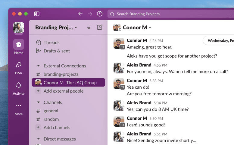
Really, really sick brand guy. This mad Serbian guy. He's phenomenal. He does everything. Honestly, it's madness.
Project Info
Client: Connor Martin, Founder at JAQ Group
Industry: Fragrance
Market: United Kingdom, Europe
Year: 2023Services: Market Research, Competitive Analysis, Brand Strategy, Positioning, Audience Development, Messaging, Naming, Visual Identity, Packaging Design, Website Design, Creative Direction, Advertising Concepts, Brand Guidelines
Notwife
Home Beauty Products
Disclaimer
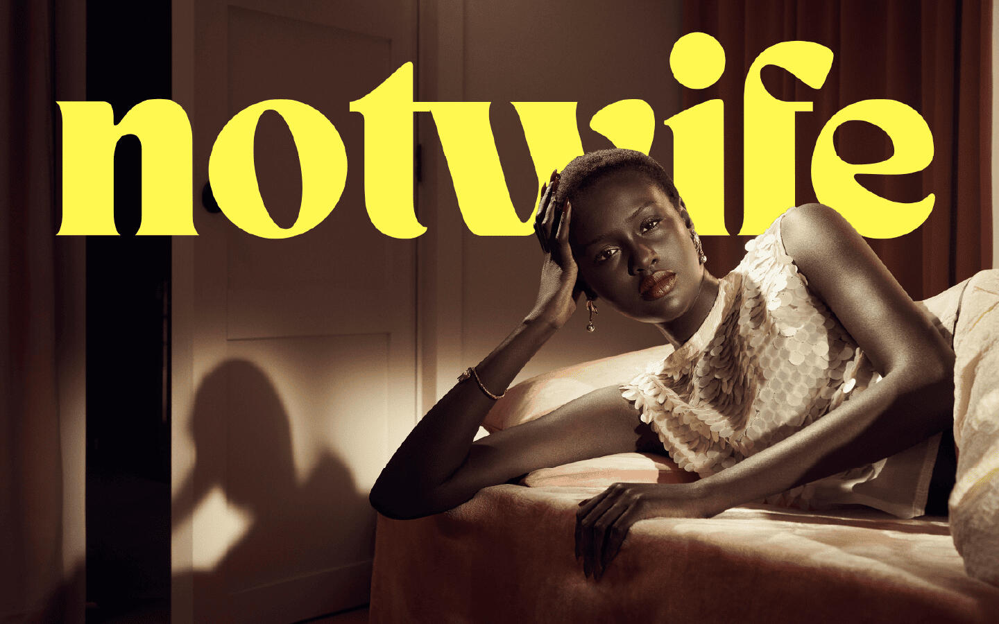
Photography © Zara. Images are used for inspiration and reference purposes only and are not part of this brand's assets. No rights are claimed or granted.Source: Zara Studio Woman Spring/Summer 2024 featuring Fei Fei Sun, Rosalieke Fuchs, Nyawurh Chuol, and Vivienne Rohner. Photography by Steven Meisel. Styling by Karl Templer. Creative Direction by Baron & Baron.
Overview
The original brief was straightforward:Create a premium home cleaning brand capable of launching with laundry detergent before expanding into a broader range of home cleaning products.However, after researching the market, audience, and category dynamics, it became clear that every major competitor was solving the same problem: cleaning the house.The opportunity wasn't another cleaning brand. The opportunity was creating an entirely different reason for people to care.
Challenge
Most home cleaning brands speak to wives, mothers, homeowners, and families. Their messaging revolves around germs, stains, hygiene, efficiency, and household maintenance.But a growing segment of women didn't see themselves in those brands. Many were living alone for the first time, renting small flats in expensive cities, working remotely, delaying marriage, and building independent lives on their own terms.They weren't trying to become better homemakers. They were trying to create a home they actually loved living in.The challenge was finding a position in the market that could emotionally connect with this audience while remaining commercially viable as a modern homecare brand.
Approach
The project began with extensive research across traditional cleaning products, eco-friendly cleaning brands, luxury homecare brands, fragrance-inspired detergents, and emerging direct-to-consumer challengers.A clear pattern emerged. Most brands competed on cleaning power, safety, sustainability, and convenience. Very few focused on the emotional role a home plays in the lives of independent women.Instead of asking, "How do we sell detergent?", the question became: "What does home mean to a 30-year-old woman today?" That shift led to a completely different strategic direction.For many women, home isn't simply a place. It's a sanctuary, a workspace, a creative studio, a social space, a reflection of identity, and a place to recover from the pressures of modern life.At the same time, rising rent, shared accommodation, limited budgets, and temporary living situations often leave people feeling disconnected from the homes they actually live in.Notwife was built around the idea that even small rituals can help transform a living space into something more beautiful, comforting, and personal.
Solution
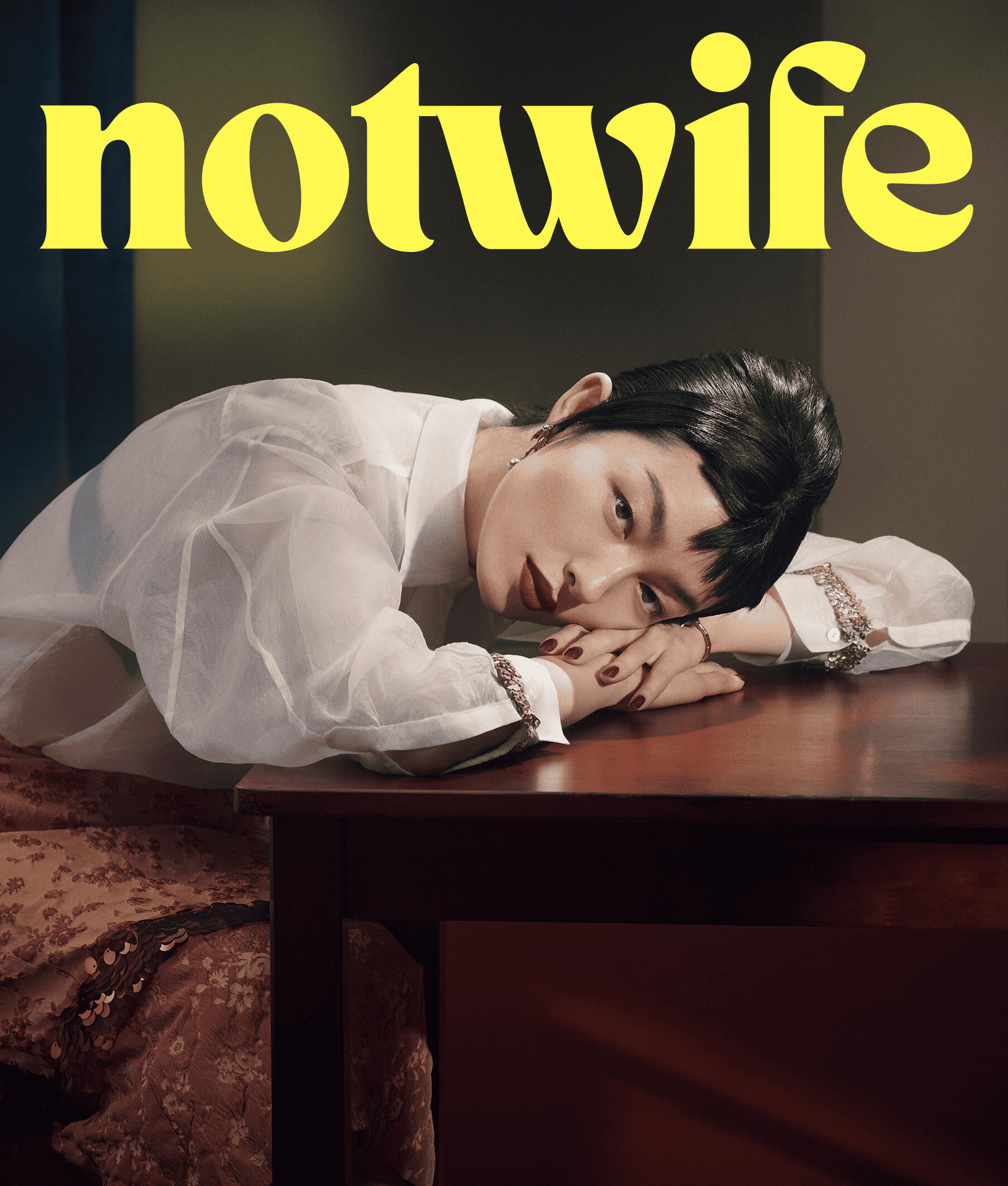
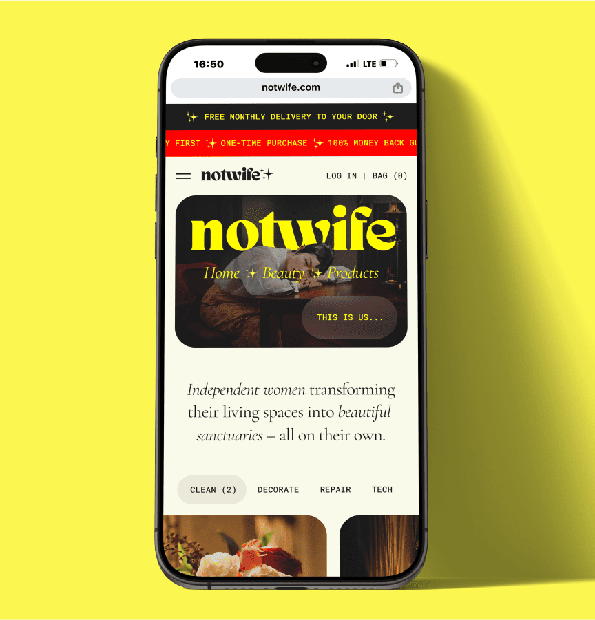
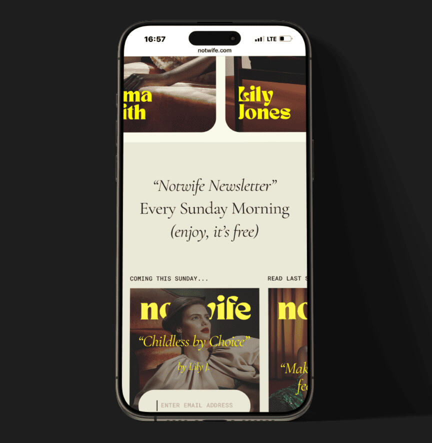
Rather than positioning Notwife as another cleaning brand, the brand was reframed as: Home Beauty Products for Women-Headed Households.The brand no longer competed on cleaning performance alone. It competed on aspiration, atmosphere, self-expression, and emotional wellbeing.The name "Notwife" intentionally challenged traditional expectations around domesticity while celebrating independence and autonomy.Supporting this positioning was a simple belief:
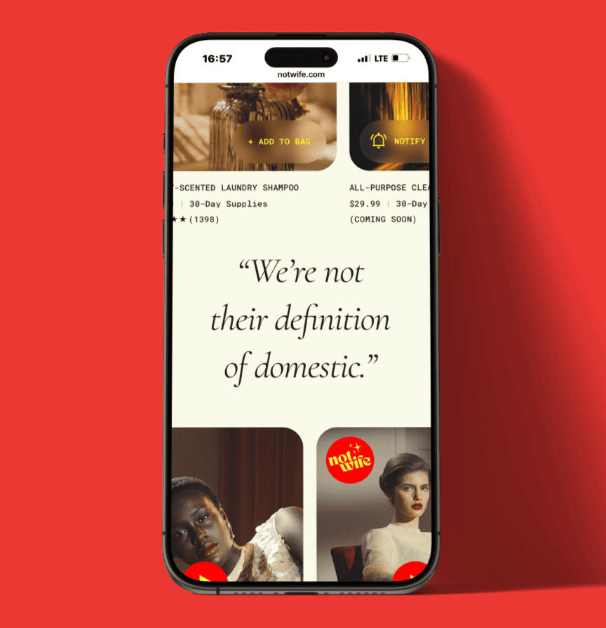
"We're not their definition of domestic."The resulting identity borrowed visual cues from fashion, beauty, and lifestyle brands, feeling closer to a magazine than a traditional household product company.
Outcome
The final brand transformed a functional product category into an aspirational lifestyle proposition.Instead of selling detergent, Notwife sold the feeling of creating a beautiful sanctuary on your own terms.The strategy created a scalable foundation capable of expanding beyond laundry care into multiple home categories—including cleaning, decorating, repair, and technology—while demonstrating how strategic positioning can create value far beyond the product itself.
Project Info
Client: Connor Martin, Founder at JAQ Group
Industry: Home Care
Market: United Kingdom
Year: 2024Services: Market Research, Competitive Analysis, Positioning, Audience Development, Messaging, Naming, Visual Identity, Packaging Design, Website Design, Creative Direction, Social Concepts, Advertising Concepts, Brand Guidelines

Drēm Team
Sleep Solution for New Parents
Overview
Drēm Team was created to solve a problem millions of parents quietly endure: exhaustion.The sleep category is crowded with products designed to help people fall asleep. But during the research process, a much more specific opportunity emerged...New parents aren't struggling because they can't fall asleep—they're struggling because their sleep is constantly interrupted.The goal was to move away from generic wellness positioning and create a brand built around the realities of modern parenthood.
Challenge
The sleep patch market was already saturated with brands competing around nearly identical promises: fall asleep faster, stay asleep longer, and wake up refreshed.Most brands targeted everyone, from professionals and travelers to wellness enthusiasts and people with insomnia.The category lacked focus and emotional relevance, overlooking the human stories behind poor sleep.The challenge was to identify an underserved audience and build a brand that felt impossible to confuse with every other sleep product on the market.
Approach
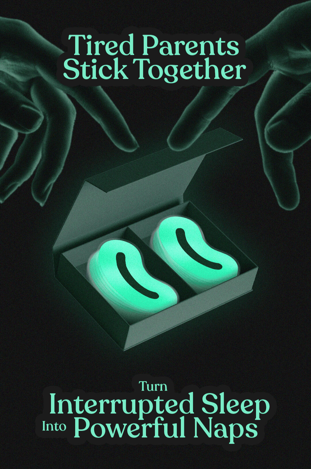
The project began with research across the broader sleep market before narrowing into specific customer segments.One audience consistently stood out: parents of young children. Unlike traditional sleep consumers, parents rarely have the luxury of uninterrupted sleep.Their nights are fragmented by feeding schedules, crying, illness, and constant caregiving responsibilities.A key insight emerged: parents don't need help sleeping through the night—they need help surviving the night.Instead of positioning Drēm Team as another sleep aid, we reframed it as a recovery system for interrupted sleep.The breakthrough came from observing a simple behavior almost every parent already practices: taking short naps whenever the opportunity arises.This led to a completely new positioning: Turn Interrupted Sleep Into Powerful Naps. This transformed the product from a sleep patch into a parenting tool.
Solution
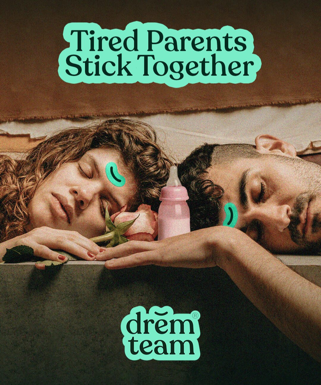
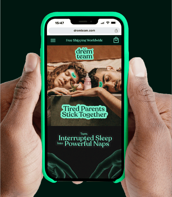
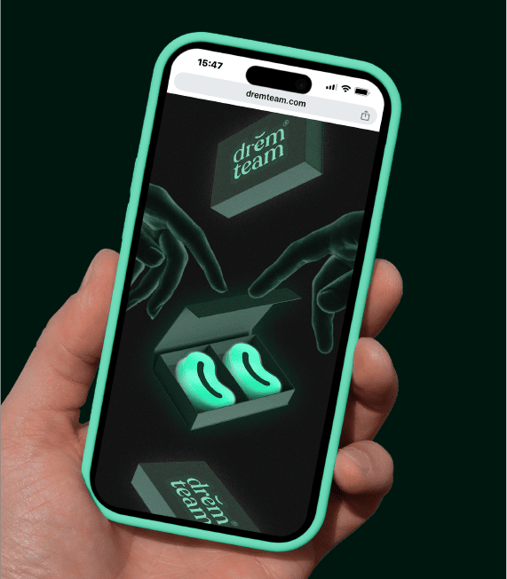
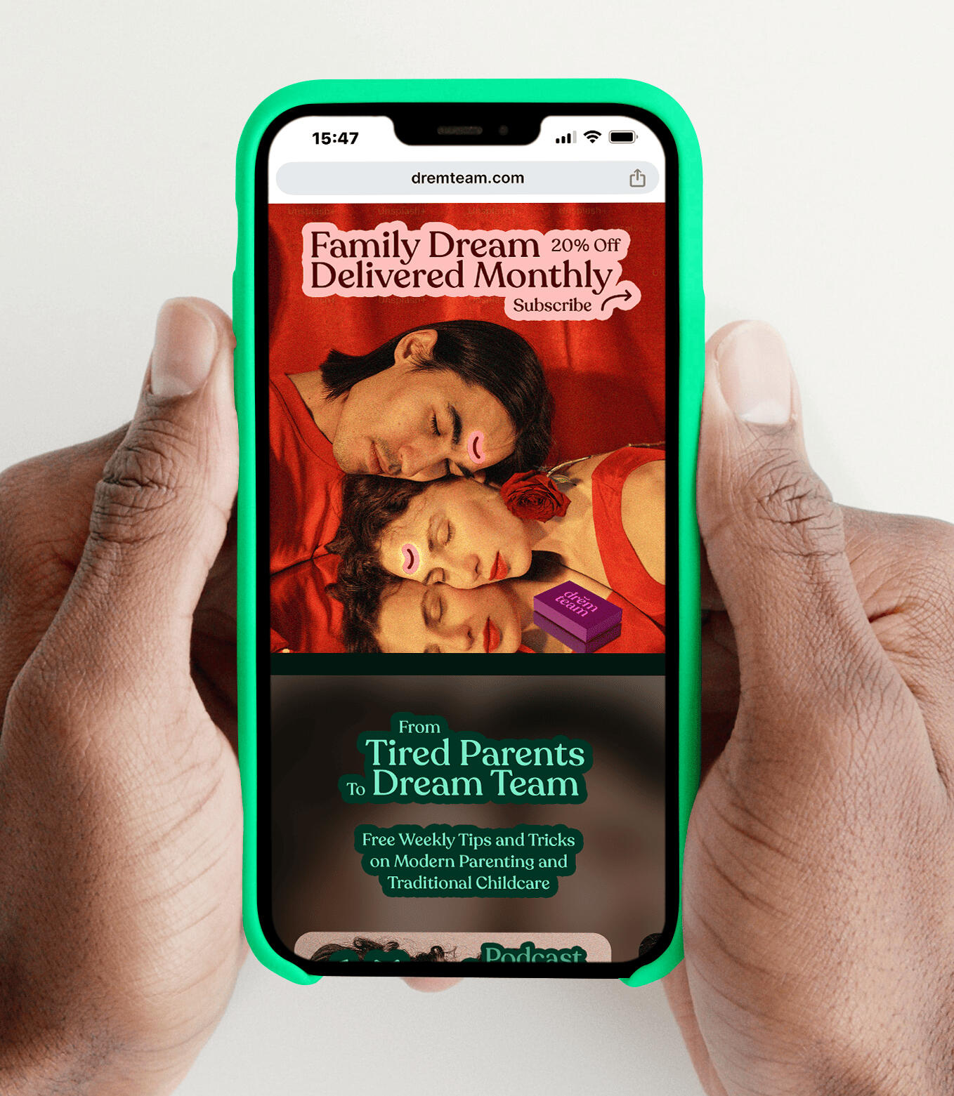
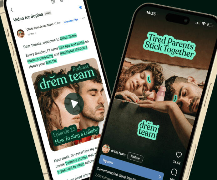
The brand was built around one central belief: Tired Parents Stick Together.More than a tagline, it became the foundation of the entire strategy. The product itself was reframed as a dual-patch ritual—one patch for mom and one patch for dad—turning recovery into a shared experience during one of the most demanding stages of life.The messaging expanded beyond sleep into better recovery, stronger relationships, and improved support for child development.Visually, the brand adopted a warmer and more emotional aesthetic centered around parents, partnership, family life, and resilience.Rather than portraying perfection, Drēm Team embraced the realities of modern parenthood and positioned itself as a trusted ally for exhausted families.
Outcome
The project resulted in a complete launch-ready brand system including strategy, positioning, naming, messaging, visual identity, packaging, website design, creative direction, advertising concepts, and brand guidelines.The final concept established a unique category position: a sleep recovery system designed specifically for parents.By transforming a generic sleep product into a mission-driven parenting brand, Drēm Team achieved a level of emotional relevance and differentiation rarely seen within the sleep category.

He just gets it, understands everything needed and is perfect for this.
Aleks is amazing to work with.
Project Info
Client: Connor Martin, Founder at JAQ Group
Industry: Health & Wellness
Market: United Kingdom
Year: 2025Services: Market Research, Competitive Analysis, Positioning, Audience Development, Messaging, Naming, Visual Identity, Product Design, Packaging Design, Website Design, Creative Direction, Advertising Concepts, Brand Guidelines